Brand Kit · v1.0.0
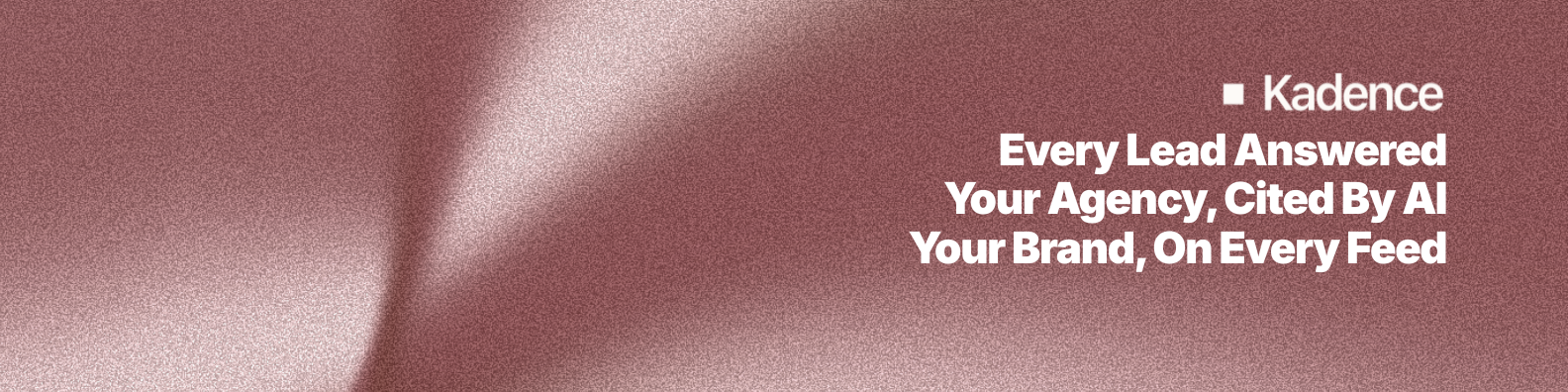
Kadence
AI built to grow life insurance distribution, front to back office. A minimalist, editorial, architectural identity built on precision, trust, and clarity, with one rust accent, generous air, and two geometric primitives.
One file: every logo, mark, and icon plus CLAUDE.md (instructions an AI tool
reads first), DESIGN.md, the full design spec you can drop straight into
Claude Code or another AI tool, and a machine-readable brand-spec.json.
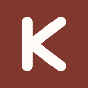
01 / Logo
Identity
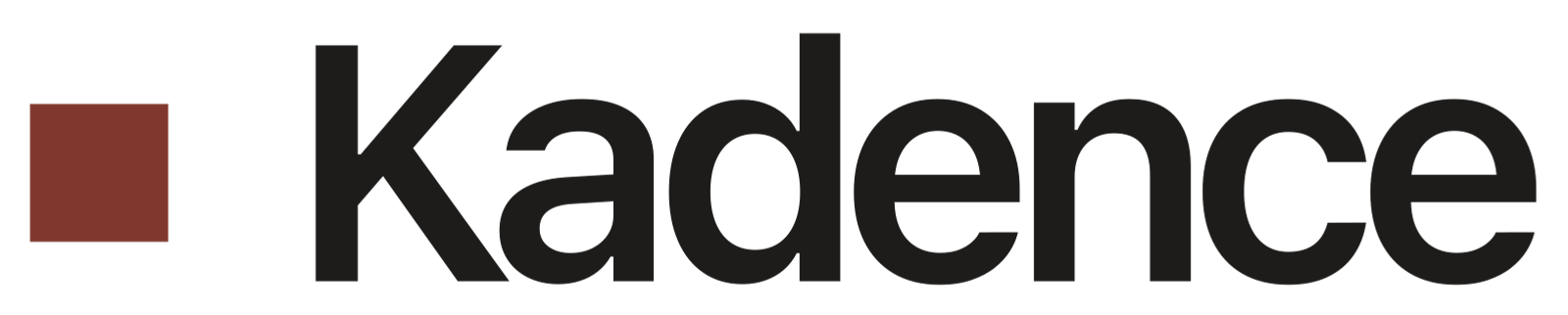
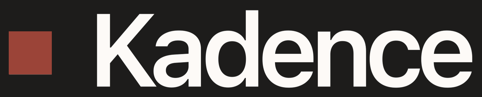
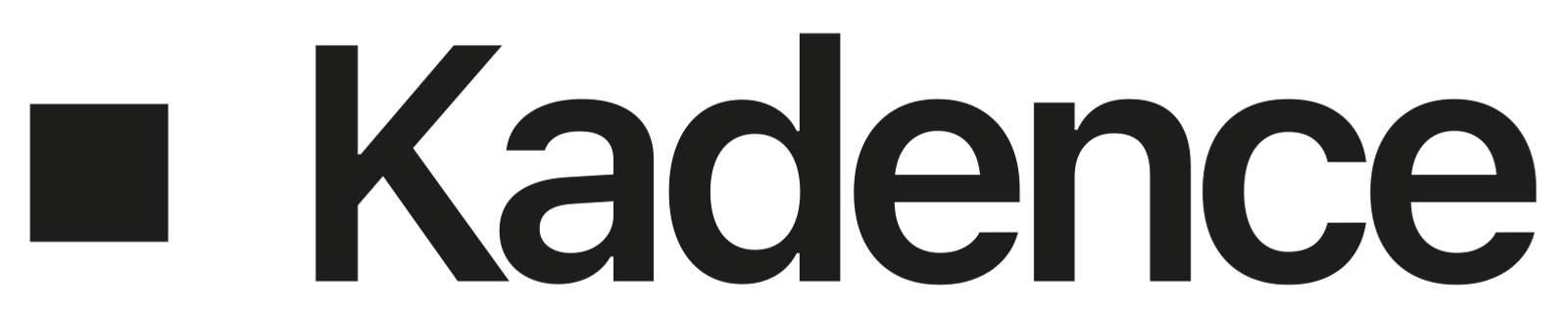
The wordmark, marked by a Node.
The primary lockup is the word Kadence set in Geist at display weight with tight tracking, preceded by a single rust Node. The mark recolors as a unit. Never separate the Node from the word, and never set the wordmark in another typeface.


Clearspace
Keep clear space around the lockup equal to the height of the Node on all sides. Minimum legible width: 96px for the lockup, 24px for the monogram.
02 / Color
Palette
Monochrome warmth, one rust accent.
A warm Snow base, near-black text, and a single rust accent used with restraint. The cool Mist is our blue, the calm counterweight to the rust, and it deserves more airtime: alternate it with Snow to give long pages an editorial rhythm. This section sits on it. Click any swatch to copy its hex.
Core palette · the four that matter
Full tokens · for developers
03 / Typography
Type
Geist for voice, Geist Mono for the technical register.
One cohesive family does the work. Headlines and body share Geist; the mono face is reserved for eyebrows and labels. Headlines are always sentence case, never ALL CAPS.
04 / Visual grammar
Primitives
Two shapes carry the whole system.
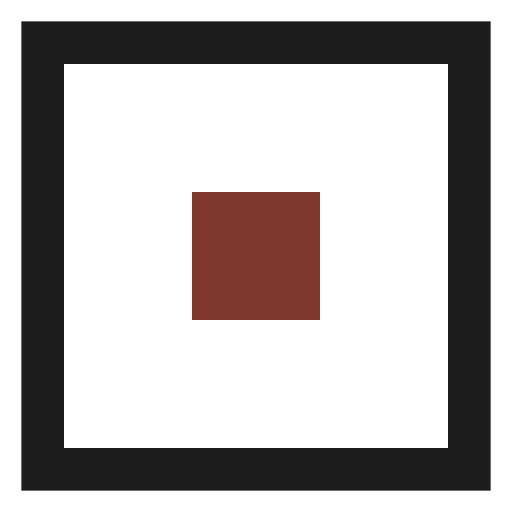
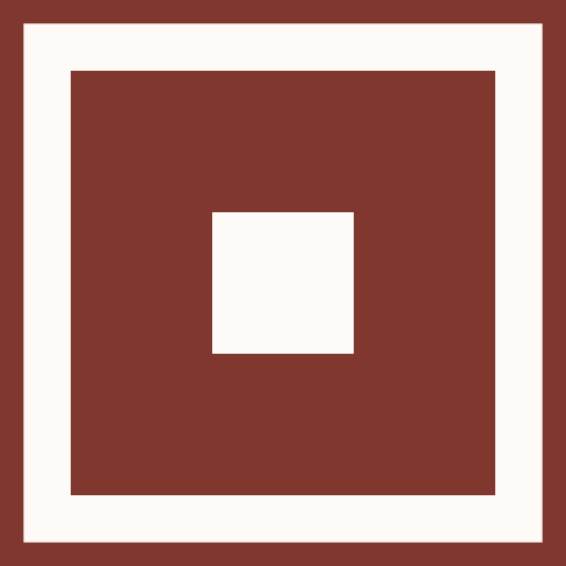
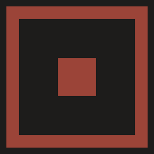
The Frame and the Node are the Kadence vocabulary: architectural, precise, and never decorative for its own sake. Everything geometric in the brand derives from these two.
The Frame
A stroked square, no fill. A visual container that echoes architectural structure and the rectangular nature of a policy document. Wrap imagery and callouts. Never fill it; its power is the negative space inside.
The Node
A small filled square. A point of focus, precision, measurement. Marks list bullets, timeline points, metric callouts, and sits beside the wordmark. Always small; restraint is the point. Never larger than 10px in context.


05 / Components
Building blocks
Architectural, never playful.
Soft corners (6-10px), hairline borders, flat-first surfaces. No pills, no circles, no drop shadows on text. One primary action per view.
Primary rust, secondary outline. 12×24 padding, 6px radius, bold.
Coverage
Mono, 11px, uppercase, tracked 0.1em, rust. Categorizes before a headline.
Card
Floating on any surface
Snow fill, 1px border, 10px radius, elevation 1. The hairline keeps it visible on both Snow and Mist sections.
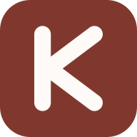
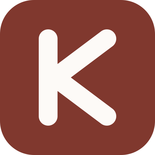
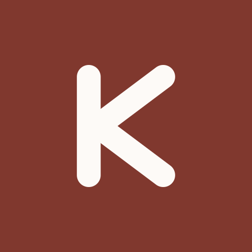
06 / App icons
Favicon & PWA
The Frame + Node, black on snow.
One geometry, rasterized per platform. The black frame holds the rust node at center, straight from the visual grammar. Every file is downloadable below.
07 / Standards
Do & Don't
Restraint is the brand.
- Use sentence case for every headline.
- Let whitespace breathe, padding first, density second.
- Wrap purposeful imagery in the Frame.
- Use Nodes as bullets and timeline markers.
- Lead a headline with the mono eyebrow.
- Limit rust to one CTA per view.
- Keep body copy at 16px / 1.6 minimum.
- Don't fill the Frame, it is always stroked.
- Don't use pill or circle shapes. No rounded-full.
- Don't use rust as a large background fill.
- Don't mix more than two type weights per block.
- Don't put drop-shadows on text.
- Don't retint the rust outside bright and deep.
- Don't use rainbow palettes or gradients.
08 / Downloads
Handoff
Every asset, hosted and downloadable.
Logos and grammar marks ship in both SVG and PNG; favicons ship per platform. Right-click to copy a link, or use the download links below.
Logos
Primary lockupSVG Primary lockupPNG Reversed lockupSVG Reversed lockupPNG Lockup on blackself-contained tileSVG Lockup on blackself-contained tilePNG All-black lockupsingle-color watermarkSVG All-black lockupsingle-color watermarkPNG WordmarkSVG WordmarkPNG MonogramSVG MonogramPNGGrammar marks
FrameSVG FramePNG NodeSVG NodePNG Frame + NodeSVG Frame + NodePNG Frame + Node reversedsnow, for dark surfacesSVG Frame + Node reversedsnow, for dark surfacesPNG Frame + Node on rustself-contained tileSVG Frame + Node on rustself-contained tilePNG Frame + Node on blackself-contained tileSVG Frame + Node on blackself-contained tilePNG
Prefer one file? Download the full kit (.zip), it bundles
every asset above plus CLAUDE.md, DESIGN.md and brand-spec.json. Machine-readable
design tokens are also embedded in this page as
<script type="application/json" id="kadence-brand-spec">.
Brand questions or need a format that is not here? Email hi@startkadence.com.